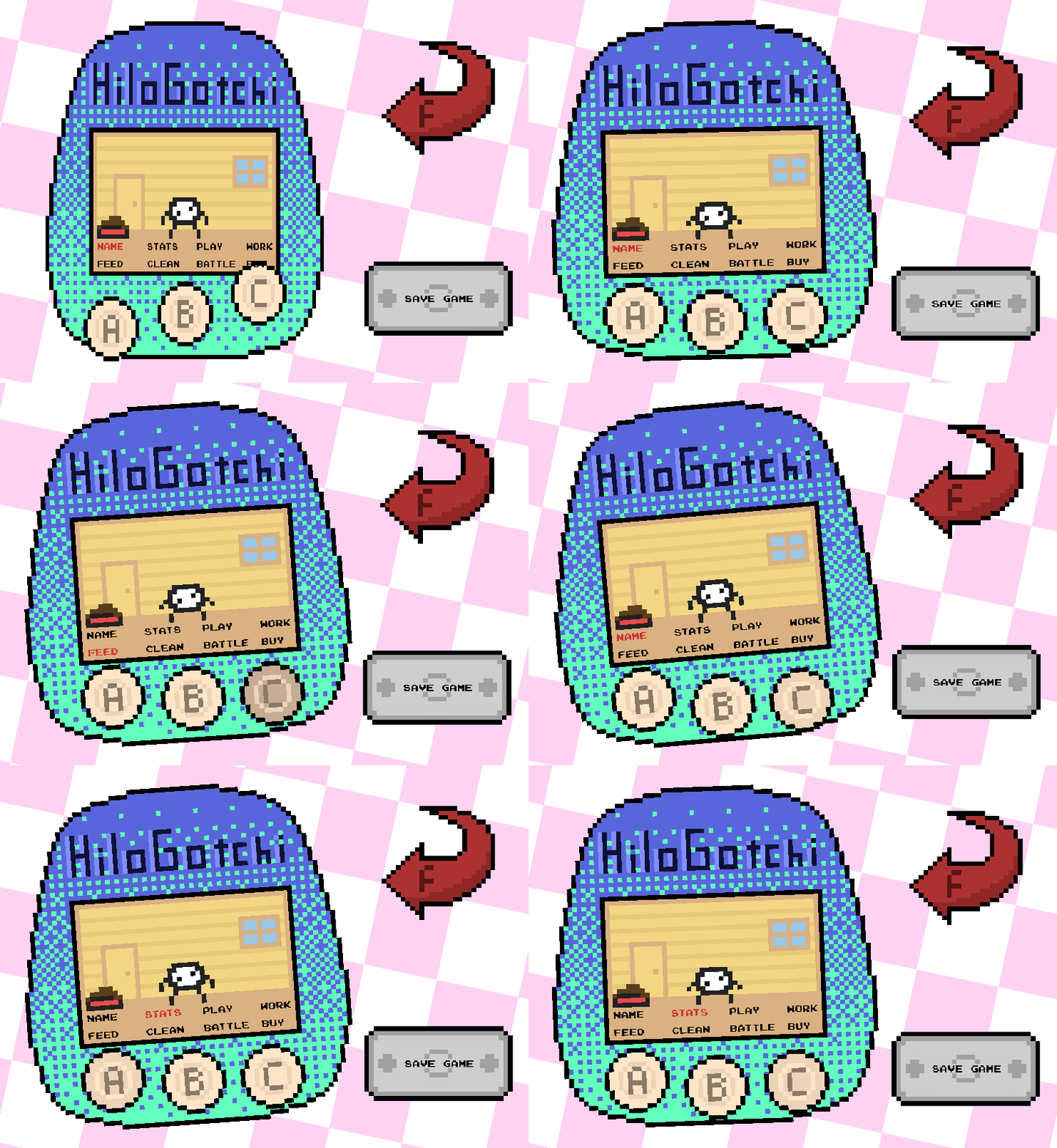
Hilogotchi First Release


Hilogotchi Alpha Stage
I've been working on a small Virtual Friend game over the past few weeks, and decided now it was a good time to release it for feedback from the public. Right now, everything just barely works. I'd like to get some conceptual feedback, as well as some more hands on it for the exploratory phase. Please share, comment, and leave any and all feedback!
Plans/In Progress
So the demo that's on Itch is messy. Like, very messy. I've fixed 90% of the errors I've stumbled across, and fully fleshed out the last few panels (besides battle). I'm currently working on the following for the next Web Release:
- Randomly colored pets upon reset
- Working Out/Training Your Pet/Playing With Your Pet
- Stats and improving the naming system
- Balance Fixes
- UI updates
And I'm sure there's a bit more. I already have most implemented, just haven't had the time to find a good stopping place for the build.
Get My Personal Hilopet
My Personal Hilopet
A remixed, digital animal to love! Play with, train, and take care of your virtual friend.
| Status | Released |
| Author | hilovids |
| Genre | Simulation, Role Playing |
| Tags | 8-Bit, Arcade, Cute, demo, Pixel Art, Retro, Singleplayer, Unity, Virtual Pet |
| Languages | English |
| Accessibility | High-contrast, One button |
More posts
- My Personal Hilopet - Release and LaunchMar 08, 2022
- Hilopet - (Almost) On Steam!Feb 16, 2022
- Update #8 - Bug FixesJun 16, 2021
- Update #7 - Hilopet Version 0.999999...Jun 16, 2021
- Update #6 - A New Name!Jun 15, 2021
- Update #5 - Steam Plans and Combat 1.5 (I'm workin on it I promise)Jun 14, 2021
- Update #4 - Now In Technicolor!Jun 12, 2021
- Update #3 - Combat Screens Sneak Peek (And Music!)Jun 11, 2021
- Update #2 - Broken Combat HotfixJun 10, 2021
- Update #1 - Combat UpdateJun 10, 2021

Comments
Log in with itch.io to leave a comment.
It's really charming so far, I have a soft spot for these old things. The pixelart looks nice for what it is, and the backgrounds + the colors of everything reminds me of the PS1 era. The fact that I can flip it around to find the reset button is a nice touch (plus the Easter Egg is cool too)! The only complaint I could possibly come up with is that the confirm button in the shop should take you back to the main screen instead of putting you back in the shop. Other than that, it looks really clean so far, plus the little dances and such fit my exact sense of humor perfectly. Good luck on the rest of this thing!
You're a gem. Thanks for writing this out Sage. Definitely! There are a few panels I need to have navigate back to MM instead of their respective parents, but that might be an artifact of the obnoxious menu system I implemented instead of doing something normal like a normal human. Writing it down!